The Great Liquid Glass Do-Over: How Apple Conceded to UI Critics in iOS 27 and macOS Golden Gate
A year after debuting its highly polarized "Liquid Glass" design language, Apple has rolled out massive visual and accessibility refinements at WWDC 2026. From a brand-new system-wide opacity slider to enhanced back-end diffusion, here is how Cupertino is responding to critical feedback.
Key takeaways
- • A year after debuting its highly polarized "Liquid Glass" design language, Apple has rolled out massive visual and accessibility refinements at WWDC 2026
- • From a brand-new system-wide opacity slider to enhanced back-end diffusion, here is how Cupertino is responding to critical feedback
The Great Liquid Glass Do-Over: How Apple Conceded to UI Critics in iOS 27 and macOS Golden Gate
When Apple introduced Liquid Glass at WWDC 2025, the new design language was pitched as the biggest visual evolution since iOS 7. By combining the optical properties of physical glass with real-time refraction, Apple aimed to build a highly dynamic, depth-oriented user interface.
However, when the design rolled out to the public, the reaction was deeply split. Many complained that the heavy translucency degraded contrast, making text and buttons blurry and incredibly difficult to read—especially on Macs equipped with traditional LCD screens rather than high-contrast OLEDs.
At WWDC 2026, Apple made a rare move: they didn’t abandon Liquid Glass, but they fully surrendered to the critics. Across iOS 27, iPadOS 27, and macOS Golden Gate, Apple has introduced a massive design overhaul designed to prioritize usability.
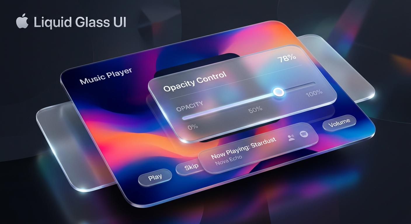
The Concession: The Opacity Slider
The most significant change in the beta releases is the introduction of a dedicated Liquid Glass Opacity Slider located under Settings > Appearance.
Previously, users only had a binary choice between clear and tinted presets. The new slider offers a continuous spectrum of customization. Sliding all the way to the left produces an "Ultra Clear" aesthetic for those who love high transparency. Dragging it to the right increases the tint depth, dialing the UI back toward a highly legible, almost opaque presentation.

Under-the-Hood Rendering Overhauls
Beyond the user-facing slider, Apple has completely re-engineered how the Liquid Glass engine renders background content.
The system now diffuses complex background images and dynamic screen elements far more effectively. To solve the legibility crisis, Apple added:
- Darkened Edges: Floating panels and context menus now feature subtle, darkened outlines that clearly separate them from the content beneath.
- Specular Highlights: Brighter, physical reflections along the borders establish distinct depth and mimic real-world lighting.
- Responsive Scrolling: Floating toolbars now dynamically shift opacity when complex text passes directly beneath them.
macOS Golden Gate Refinements
The "half-baked" implementation of Liquid Glass on macOS 26 has also received dedicated polish in macOS Golden Gate (macOS 27).
Alongside the opacity settings, macOS Golden Gate introduces uniform toolbar sizes across system apps and a fixed window corner radius to fix visual inconsistencies. Additionally, app sidebars now stretch edge-to-edge and regain colored icons (which were controversial casualties of last year's update), making active windows much easier to track.
Developers are also getting a revamped Icon Composer tool, allowing them to build app icons with multiple layers of responsive Liquid Glass for improved sharpness.
As Shubham Kedia, Apple's Director of Human Interface, stated during the keynote: "Like with all major design updates, there is a natural process where we take a bold leap forward, and then we continue iterating." For users who value accessibility as much as visual polish, this iteration is a highly welcome update.
Tags
Grounded sources & citations
What to read next
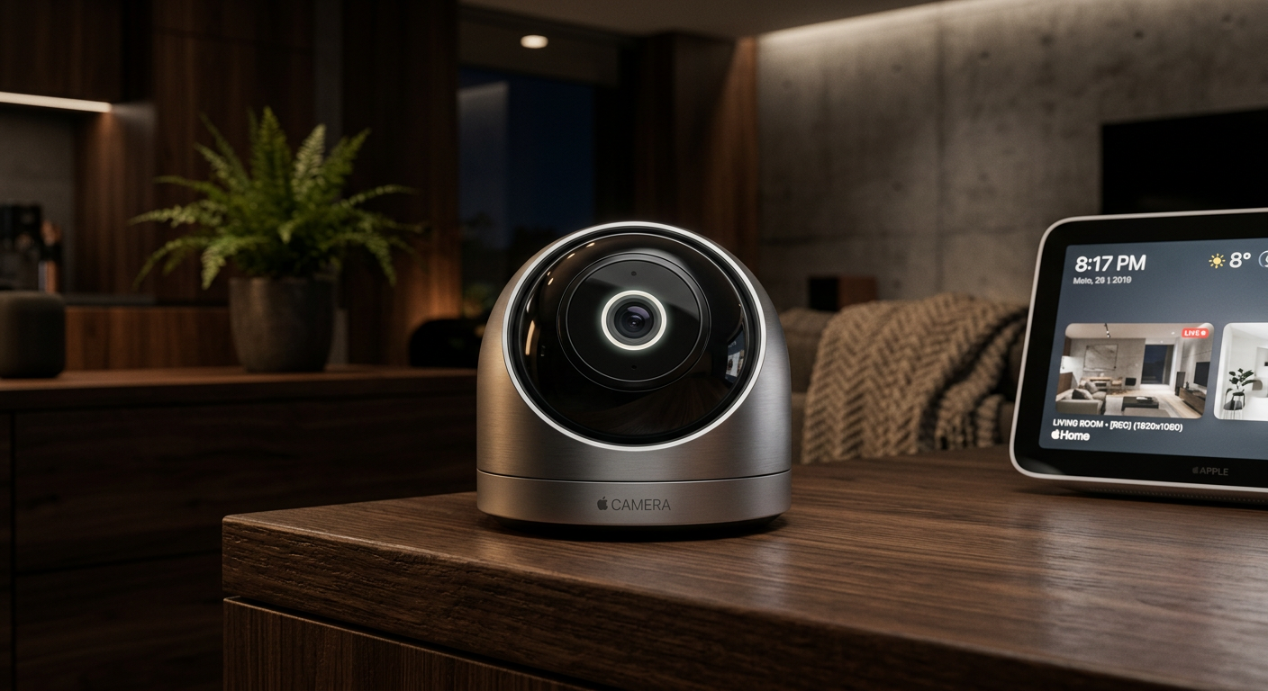
Apple’s Privacy-First Gamble: Inside the 2026 First-Party Smart Security Camera Revolution
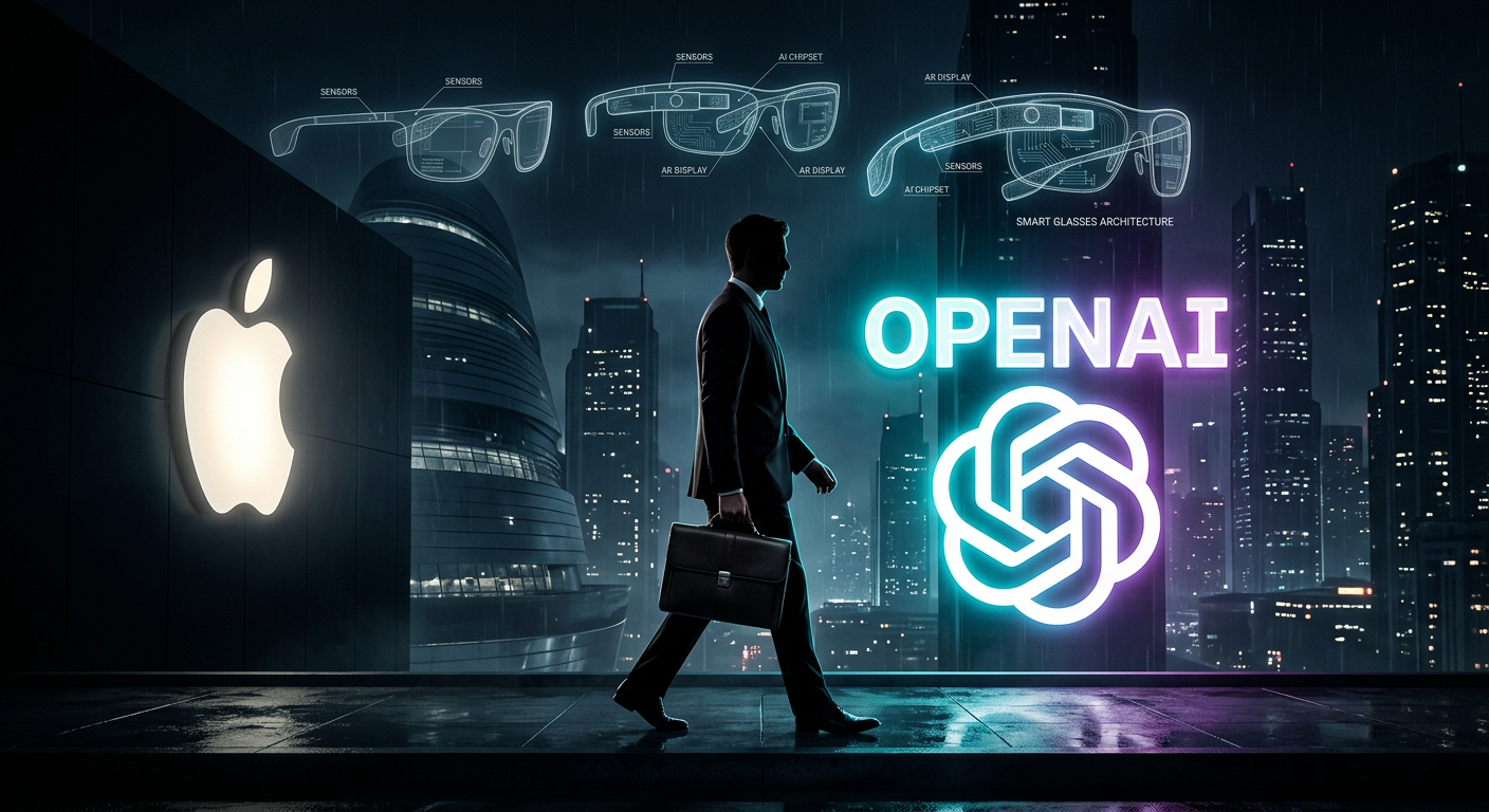
Silicon Valley Shake-Up: Vision Pro Chief Paul Meade Defects to OpenAI
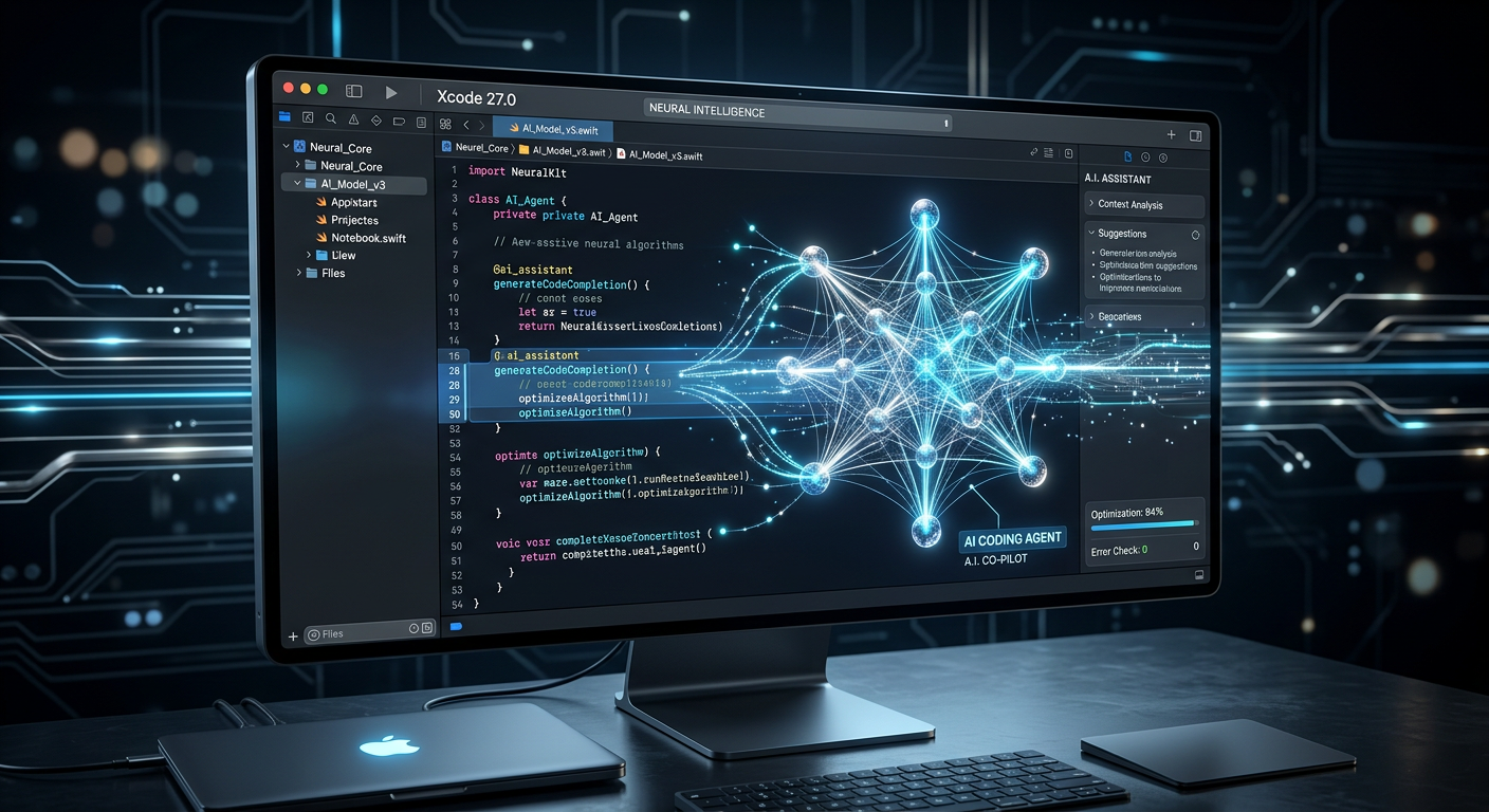
The Agentic IDE: How Xcode 27’s Native MCP Server is Rewriting Apple Development
Enjoyed this? Get the next one
Subscribe to the newsletter and the next playbook lands in your inbox — no spam, unsubscribe anytime.